Pages

Showing posts with label PrettyPinkPosh. Show all posts

Thursday, 2 July 2020

6 Card Rescue Plan


What do you do when you have a plan for a card, and it FAILS? Head to the Pretty Pink Posh blog to find out!


Monday, 15 June 2020

Geometric Father's Day Card


When you think of making a masculine card, the words pretty, pink and posh may not be the first ones to come to mind! But here's proof that Pretty Pink Posh products can make a perfect patterned card for pop! (see what I did there? lol!)

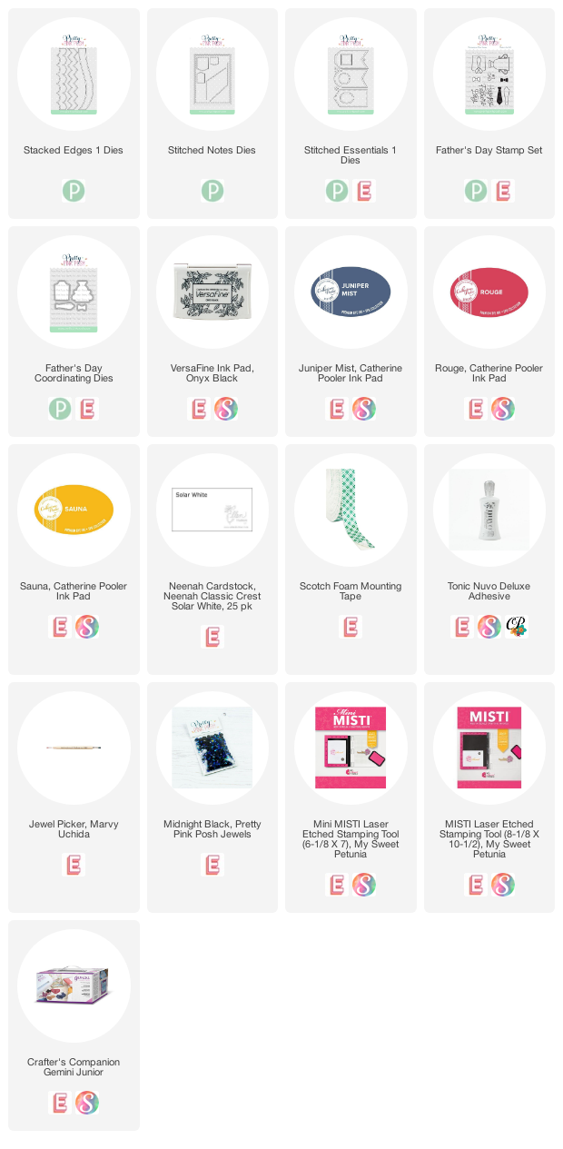
I started by cutting 5 of the zig-zag border die from Stacked Edges 1 and blending Juniper Mist ink over them. Then I lined up 3 of them and blended the same ink darker on each 'half' of a zig (or is it a zag?).

I blended darker ink on the opposite halves of the other 2 strips - this will give my pattern that look of dimension.

I glued them on a panel of white cardstock, and then trimmed everything with the stitched rectangle die from Stitched Notes.

I blended a larger panel of white cardstock with Sauna, Rouge and Juniper mist inks and cut the stitched rectangle die from the centre, to create a frame around my blue and white panel (and to save most of the blended panel for another card project!)

For the sentiment, I cut a stitched circle and stitched oval from Stitched Essentials 1 and I stamped the sentiment from Father's Day on the circle. I blended Sauna and Rouge ink on the oval and then I 'extended' it by cutting it in half and putting the two pieces on some tape, with a small space between the two halves.

I finished with 3 Midnight jewels - these are black with an iridescent shine.


Tuesday, 2 June 2020

Overlapping Stencil Technique


Over the weekend, I was playing around with the idea of using a stencil and some masking to create a kind of 'overlapped' look. These 3 cards were the result.


I started with this one. I placed the Pretty Pink Posh Wide Stripes stencil onto a white panel of cardstock, on an angle. I masked the 'top' edge of the stencil and blended green, aqua and blue ink through it. (this is the top right area of this card).

Then I lifted the stencil, masked my blended ink stripes and placed the stencil diagonally the other way on the other corner (bottom right corner) and blended the same inks through. 

If you followed all that, you know that I originally had the blending at the bottom of my panel and open white space at the top, but as I played around with sentiments, I decided this orientation worked best for legibility of the Pond Friends sentiment. I added the 3 heart stamp from the same set for a little pop of colour.


Next, I masked around 5 stripes on the stencil itself and then blended the inks through onto the white panel (this is the set of 5 stripes that appear to be on top of the others). I lifted the stencil, masked those blended stripes on the panel, and then turned the stencil 90 degrees and blended the inks in the opposition direction. This is the same thing you would to to create a plaid, but because of the masking over the first layer, I got this overlapping appearance. I finished with the heart die from Pinata Party (layered up) and a sentiment from Thoughtful Greetings.


This is a similar idea - this time I masked around 3 stripes on the stencil and blended the ink. Then I masked those 3 stripes and blended the ink through in the opposite direction. I finished this one with the hello portion from the Hello Shaker and a little friend word from Hedgehog Friends.


Sunday, 31 May 2020

Butterfly Hello!


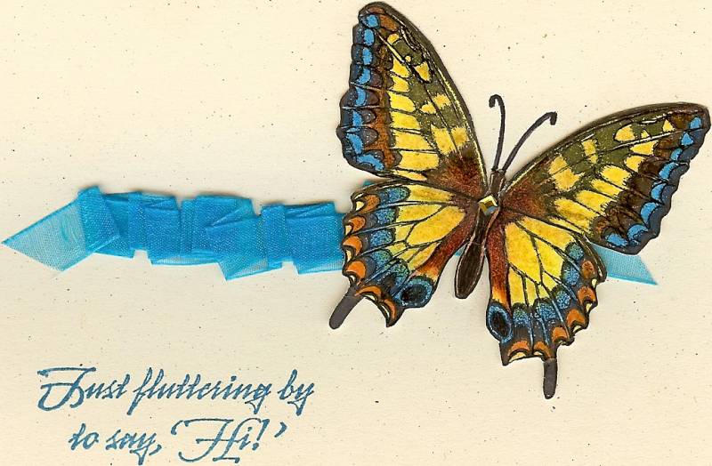
Congratulations to this week's Featured Stamper, Chrysi (knoxville8625). I chose this card as my inspiration:


I focused on Chrysi's:
-butterfly theme
-horizontal pop of colour

I changed:
-ribbon to alcohol ink
-added another butterfly


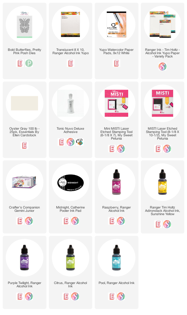
I started by trying to create the look of the ribbon with Alcohol Inks on Yupo paper. I don't know if you know this about me, but I'm a little bit of a control freak. And I don't know if you know this about alcohol inks, but you can't control them. So that's a match made in heaven, right? LOL! This was my 4th or 5th panel.

When I finished that, I put some yellow, pink and purple inks down on another piece of Yupo paper. This was actually easier, because I knew I was going to die cut it and I wasn't worried about keeping the colour in a particular area of the panel. 

I die cut two of the butterflies from the panel, and placed them on top of my 'ribbon'. I didn't love the blue/green showing through the holes, so I used the negative pieces of the die cuts to draw two outlines onto white cardstock. I cut them out with scissors and glued them behind the butterflies. Now I'm kind of wishing I had thought of using vellum for a more translucent look, but these are nice and bright.

I used a Copic marker to colour the bodies black. 

Finally, I stamped my sentiment. I don't have any black Stazon ink (which is good for stamping on non-porous surfaces), so I used my Catherine Pooler Midnight ink. This ink is archival (the rest of her colours are not), and although it took a long time to dry, it worked.


Monday, 25 May 2020

Scalloped Father's Day


Are you Zooming these days? I have weekly calls with some crafty friends and also with my family, and while I'm on a call, I like to have something to work on. This card came about during my family call this weekend.

I started with a partial rainbow of inks - orange to yellow to green to deep teal and I blended my initial layer of ink:


Then I used the scalloped border die from Stacked Borders 1 to create a positive die cut and a 'negative' border:


I used the negative border like a cloud edge and started at the top (since it was my lightest colour and I didn't want to keep cutting stencils) and blended more ink over top:


Then I used the positive die cut as a spacer to line up the scalloped stencil (and despite my best efforts, I see a slant creeping in! lol!)


I continued working my way through the colours. Notice how the blending smoothed out over time (and also because of the extra layers!)


Here's the finished panel:


I trimmed the panel to straighten out that slant and to allow for a clean white border around the edge of the card.

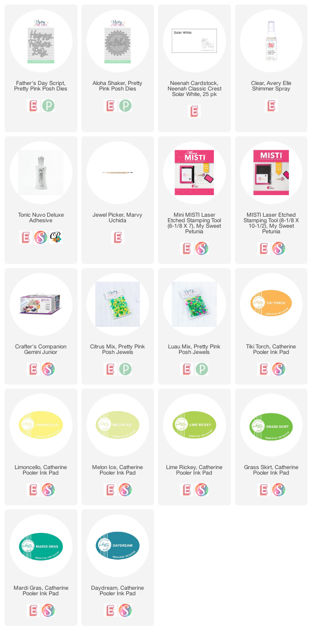
To finish the card, I inlaid the Happy Father's Day script in the centre of the panel, and also just a part of the Aloha Shaker die into the bottom of the front panel. I added some jewels from Luau and Citrus mixes.


Monday, 4 May 2020

Inspired Toucan Card


Where do you get your inspiration? I find inspiration in so many places - catalogues and ads, fabrics (and quilts!) and of course Instagram. The other day I came across an ad for this puzzle on IG:


I focused on the toucans and the jungle feel, as well as the colours - black, greens and pinks and pops of white.

I used a number of different Pretty Pink Posh stamp sets.

I started by stamping the toucans and then I masked them. I added the cluster of flowers from Geraniumd and then masked them. I used some leaves from Peonies (and you guessed it, masked them!) and some leaves from Hibiscus Flowers. I filled in space with a little flower from Tropical Toucans.

Then I coloured. And coloured! I finished with some white gel pen highlights. 

I added a sentiment from Every Day Sentiments on one of the Stitched Essentials 1 tag dies. 

 I know the scale of the various elements isn't quite right, but I love the feeling of fantasy from this!


Sunday, 26 April 2020

Church Christmas Cards April (Let Us Adore Him)


Congratulations to this week's Featured Stamper, Gloria (designzbygloria).

I chose this card as my inspiration:
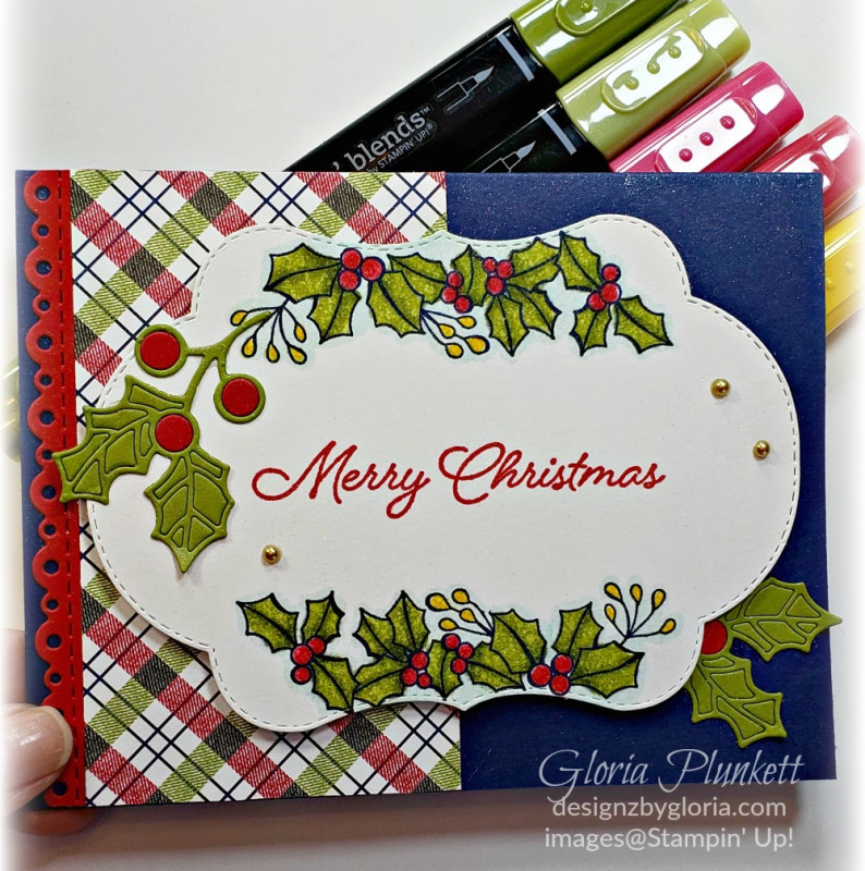


I focused on Gloria's:
-red, green & white
-plaid
-holly
-white die cut focal point for sentiment

I changed:
-orientation
-no blue
-no stamped/coloured holly
-no red border die cut

This is the design for my April set of Church Christmas Cards. I ran out of time, and this card is very simple, so I did not make a video this month.


Here's how I made 32 of these in about 2 1/2 hours:

-used Memory MISTI to stamp 2 different plaid tone-on-tone backgrounds onto 2 red cardbases at once. This was a 'new to me' process but it worked well!

-used a higher contrasting ink and stamped plaid onto some green cardstock using the same technique as above.

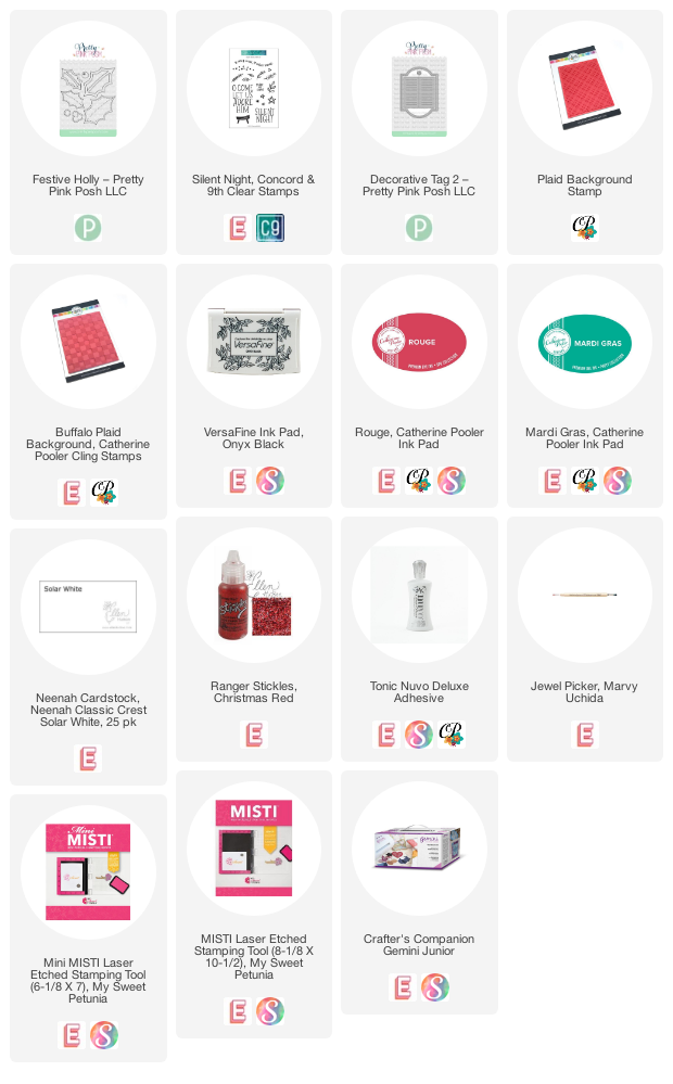
-die cut all the shapes for each card at once. This includes 2 Pretty Pink Posh Holly leaves and berries, as well as the white panel using Pretty Pink Posh Decorative Tag 2 all in one pass. This meant I did 32 passes through my die cutting machine.

-I used some speckled 'natural' white paper that I have had for ages. Not too sure I'm loving the speckles....

-used an offcut from the label as a template, so that I could place the die cut into the hole, and use my MISTI to stamp the sentiment in the same place on the label

-glued the holly and berries on with liquid glue

-added Christmas Red Stickles for some sparkle.

I now have 127 cards complete for this year - only about 200 to go!


Tuesday, 21 April 2020

Pretty Pink Posh Tulips


Today I'm sharing some cards with a different way to 'colour' the new Pretty Pink Posh tulips.

I started with a panel of white cardstock, and I stamped the tulips in the bottom left corner. Then I used the coordinating die to cut a mask and placed that over the stamped images.


I laid the Wide Stripes stencil overtop and blended ink through - green near the bottom, blue near the top, and a tulip colour around the blooms.

I added some shading to the flowers with gray Copic markers, to create a dimensional look.


Finally, I used the large Scalloped Circle die and cut it from the side of the panel, and popped it up with foam tape to create a subtle frame around the flowers.

I addd little sentiments and some embellishments to finish the cards off.


Thursday, 9 April 2020

Amazing Tulip Wreath


Good morning! Today I'm sharing a card that combines the Pretty Pink Posh Tulips set with the Gina K Wreath Builder stencil/template.

I chose the smallest,single tulip and put it into my MISTI, with a square panel of white cardstock. I stamped the tulip then turned my cardstock in the template until I had 8 tulips.

I created two masks for the tulip and then stamped the leaf between the two masked tulips, before moving the masks and stamping again, until the whole panel was filled in.

Then there was a lot of Copic colouring! I chose pinks, corals and soft yellows for the flowers and some yellow-greens for the leaves.

There was a lot of overlapped stamping in the centre, so I chose a simple stitched circle die cut and a small sentiment to finish the card.


Thursday, 2 April 2020

3 Ideas for Easter Cards using Pretty Pink Posh


Good morning! Today I'm sharing 3 pastel Easter cards using Pretty Pink Posh products.

For this card, I used the die from Easter Eggs as a stencil. I blended Catherine Pooler inks through it, and masked as I went to create a 'dimensional' background.

I used the square die from Spring Days and cut it from the panel, and then popped it up over the scalloped square die cut from white cardstock.


For this card, I blended the same inks through the Easter Background stencil. I used one of the Eyelet Border dies to create a pretty sentiment strip and I blended Hot Tub ink onto a plain white egg die cut.


Finally, I used the idea of the sentiment strip cut with the Eyelet Border die to create my pretty pastel strips on this card. I popped them up with foam tape and used an plain white (I shaded the left side with 2 Cool Gray Copic markers for 'dimension). The flower is a coordinating die from the Spring Wreath set, and the sentiment is from that set as well.


Tuesday, 24 March 2020

4 Cards using Pretty Pink Posh Crocus Stencil

click here for my 30 Days Colouring post.


Today I have 4 cards made with the new Pretty Pink Posh Crocus stencil. This stencil has several crocuses (croci?!) on it as well as leaves and I chose the biggest, most open flower for my cards, as well as some pretty pastel Catherine Pooler inks.


I started by creating a little scene of flowers and then added a die cut Eyelet Border along the left side. I stamped my sentiment with dark Gray ink.


The other three are all basically the same card, just with different colours. I blended ink through the same crocus and then cut it with a Scallop Circle die.

I added little sentiments from Animal Signs, and 3 little matching jewels for each one.

I popped the circles up over white panels that had been blended with fresh green ink, fading toward the top.

It's Easter theme week at Pretty Pink Posh and all items in the Easter Category are on sale! (sorry, this Crocus Stencil isn't one of them).


Saturday, 21 March 2020

Two Daffodil Cards featuring Pretty Pink Posh (and Blog Hop!)

click here for my 30 Days Colouring post.


Good morning! I have some more cards featuring new goodies from Pretty Pink Posh, but today it's the Ellen Hutson Design Ambassadors who are hopping (blog hop details below!)


I focused on the daffodil stamps from Spring Days.


For my first card, I masked and blended ink through 4 stripes of the Wide Stripe stencil. I stamped the daffodils so that the leaves were on the green stripe and the flowers were on the yellow. I stamped a couple of butterflies from Hedgehog Friends in the blue sky.

I used one of the Eyelet Borders edge dies on the bottom of that panel and then I popped it up over a white cardbase that had been blended with yellow ink through the Wide Stripes stencil.  I added Marigold jewels to the daffodils for sparkle and dimension. My sentiment is from Easter Eggs.


I used the daffodil window and square die for my next card, and coloured all the flowers with Copic markers. I popped the four squares up on a panel of cardstock that had been blended with Fiesta Blue ink and put the whole thing on a white cardbase. More Marigold jewels in the flower centres.


BLOG HOP DETAILS
One random & lucky commenter will win $25 to the EH shop! To enter for a chance to win, make sure to leave comments at each stop along the hop! Comment before Wednesday, March 25th at 11:59pm PDT. Winner will be notified by email.


Ardyth Percy-Robb  <<You are here!


Friday, 20 March 2020

Three Rainbow Cards using *new* Pretty Pink Posh!


Good morning! It's release day at Pretty Pink Posh and we've got lots of fun new goodies to share with you!


I used the new Baby Script die plus one of the Eyelet Borders dies and a solid heart stamp and co-ordinating die for this one.


This card features stamps and dies from the new Spring Days set. I created a frame with the the Easter egg border stamp and coordinating die and then added stripes to the square bunny image to colour-coordinate! (yes, you get a square die and a stitched scallop square die with this set!)


Finally, I used another of the Eyelet Border dies to create this 'rainbow'! The sentiment is from Ladybug Friends, which is also included in this release!