

Congratulations to this week's Featured Stamper, Trudy (daisystampinator)
I chose this card as my inspiration:
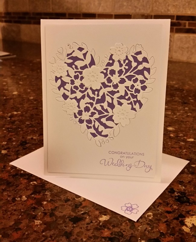
I focused on Trudy's:
-heart/flower combination
-layout
I changed:
-added colour (although I kept some purple)
-masked stamping instead of inlaid die cut
- size and occasion
Any gardeners out there? This stamp is from the Essentials by Ellen In the Weeds set, but I think maybe that name is a little mean. Can flowers this pretty really be considered weeds? lol!
I started by using EBE Folk Hearts dies to create a mask. Then I stamped the flowers onto Bristol Smooth cardstock using Versafine Onyx ink.
When I removed the mask, the bottom of the heart shape was very well defined because of where the stamping ended, but the top portion wasn't. I softly blended some blue ink through the mask to complete the shape.
Then I used some Karin BrushPro markers to watercolour my flowers. This was my first time using these markers and I tried first on the smooth side of Ranger Watercolour cardstock, but I found it too difficult to move the colours. Changing to Bristol made a big difference in my experience with these markers. I loved the big firm nibs on these markers, and the vibrancy of the colour. They reminded me of my Zig Art & Graphic Twin Tip markers and I ended up doing a comparison (see below).
When I finished the watercolouring, I will admit that though I wanted to add some splatter or sparkle or embellishments, I was really just too nervous about ruining all that colouring! lol! So I finished with a simple sentiment from EBE Up in the Air.
I backed the Bristol panel on a Slate mat and then put it on an Oyster cardbase (the one thing I really don't love about Bristol is how creamy it is and I can't seem to put it on a white cardbase! lol!)

Here's a similar card, this time coloured with the Zig markers. Similar experience and colours (although I have the full set of these markers and only 26 of the Karin, so I guess I have more options).
I would say that working with them is similar and the results are similar enough that you probably don't need both types of markers. If you have both, they work well together, so that's good too!
Note: I've only compared them on Bristol Smooth at this point - I still need to try other watercolour cardstocks to see what I think. I've seen other crafters use them successfully on watercolour cardstock.
Here they are side-by-side:

Stunning concept, they are both amazing
ReplyDeleteThanks so much!
DeleteSuch a beautiful design and execution! Thanks for the comparison!!!
ReplyDeleteThanks so much!
Deletebeautiful - I would like a really white watercolour paper too - all the brands Ive tried are various shades of cream /ivory - aghhhhh and I like white card bases -hey ho
ReplyDeleteRanger Watercolour paper is very white, but I had a hard time with it with these markers - it's excellent with distress inks though. Good luck! Thanks so much for dropping by!
DeleteStunning cards Ardyth - I particularly like the first one, with the flowers confined to the heart shape.
ReplyDeleteStay safe
Blessings
Maxine
Thanks so much, Maxine!
DeleteThese are beautiful!
ReplyDeleteHello again! :D I do wonder when you used the Karin markers, did you use a wet paint brush to blend the colors or the blender brush? Did you only blend using the Karin markers solely? Would love to see this demonstrated on one of your wonderful videos you make! ♥ Thank you!
ReplyDelete