Here's an elegant card I made for the Birthday Card Stash.....done class at StampNation. I started with the solid stamps, and inked them up with 2 or 3 Catherine Pooler inks. Once they were dry (important!!) I embossed the outline stamps and sentiment with gold.
To create my mat, I inked the edges of a slightly larger panel with Versamark ink and then sprinkled the same gold powder on the edges. This ensures that all the golds 'match'.
Running late today - but I am squeaking in my colouring for Kathy Racoosin's The Daily Marker 30 Day colouring challenge!
Today, Tracey and I are using Altenew's Bamboo Roses. I went for my quick, reliable go-to when I'm colouring, Copics. I used 3 shades in each rose and leaf to give dimension.
Once I was finished the colouring of my pretty (and dramatic) roses, I was inspired by Natalie to go bold, graphic and unexpected with my sentiment.
I focused on Karen's:
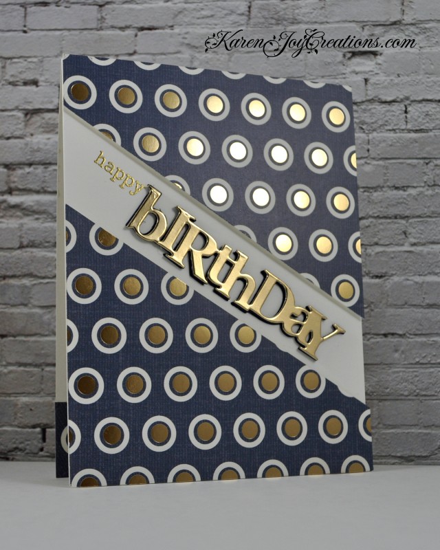
-masculine feel
-dark colour with metallic accents
-diagonal sentiment
I changed:
-technique
-layout
-pattern of metallic accents
I cut out the new Stitched Plaid Cover Plate from A Jillian Vance Design with Catherine Pooler Smoke cardstock and then a partial one from MFT Stamps Sparkline Silver cardstock so that I could inlay some sparkly squares. I randomly re-filled the holes with smoke and sparkly squares for interest and texture.
I heat embossed a sentiment and popped it up using foam tape. Tomorrow is my hubby's birthday, so this is perfect for him!
Whenever I'm doing Kathy Racoosin's The Daily Marker 30 Day colouring challenge, I quickly find that I want to do something other than copic-colouring (I love my Copics, but this challenge is a great opportunity to push yourself outside your comfort zone!)
I thought about those kids' painting books where you just use a wet brush and I wondered about watercolouring using a stamped outline. I started with Ranger watercolor paper and knew that I needed to use inks that will react with water. I chose a couple of my favourite Catherine Pooler inks and inked up my stamp. Then I spritzed it with a fine mist of water to activate the colour and moved the colour around with a brush. . I was hoping it would look stunningly beautiful at that point, (like a new method for no-line watercolouring) but it had lost a lot of definition, so I just restamped with a black outline. I used Versafine because it's water proof.
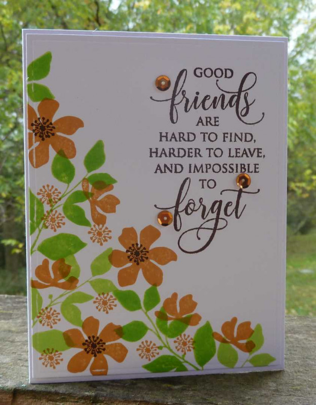
Today Tracey and I are colouring the Essentials by Ellen United We Flourish Set Good Friends by MFT Stamps.
I decided to combine it with this week's Muse challenge where Kim gave us a very sweet inspiration:
I focused on Kim's:
-characters in circles
-inkblending
I'm going to call this 'reverse' colouring. I started by cutting a circle out of a post it note. I laid it on my panel, then stamped a partial image. I left the circle mask on the panel, and then used the matching die to create a mask for the image (this gives a small white border around the image) and carefully (you don't want any of the masks to lift or move!) blended two colours of ink. I repeated this with the 4 animal images and then added some scattered hearts using the same technique.
Today, Tracey and I are colouring Altenew's Adore You. I started by creating an arrangement of the flowers and leaves, using masking. I stamped with Versafine and embossed with clear embossing powder.
I watercoloured with Altenew inks - I smooshed them on a palette and then picked them up with a wet brush.
My glittery frame is not a full panel - I cut out the centre using a smaller rectangle for future use, then popped up my watercolour panel using foam tape.
Today, Tracey and I are colouring Mondo Magnolia. I embossed the flower in white and then used Distress Ink blending. I find it so much easier to blend Distress Inks on Bristol paper - it's so smooth and it gives a good blend. I added Copics for some shading. I masked the flower before spritzing the background with water and added some sparkle with a Spectrum Noir marker.
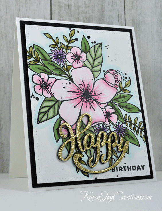
I have teamed up with my friend Tracey once again to help us stay focused and motivated to join Kathy's The Daily Marker 30 Day Coloring challenge. Today we are using Rustic Botanicals from Essentials by Ellen.
I started by stamping the flowers, varying the space between them so that there are some white areas.
I gave them 'shadows' by outlining the left and bottom areas of each petal. I love how the lines of the petals give so much dimension. I added to it by shading each coloured area with my Copics. I added clear Wink of Stella just to the colours, for a subtle touch of sparkle.
My neighbour, Mrs. Wilson, asked me to make a birthday card for her sister-in-law, who is an artist. I decided to use a faux-watercoloring technique using Distress Inks and these Essentials by Ellen stamp sets. I was inspired by the colours in the current Pin-Sights Challenge:
I placed each stamp on my stamp positioner, inked it with Distress Ink and then spritzed it with my Nuvo Mist Spray Bottle. I love how each one turns out unique, giving it an artistic feel.
My first attempt ended up being the card on the left, which I will keep. Mrs. Wilson is 88 and prefers a less CAS style to my typical designs. For her card, I added more flowers and embossed the sentiment in gold. She is not afraid to tell me when I need to do something different on a card she has requested - I will report back once I've delivered it to her! lol!
Here's my card for this week's Muse challenge, where Tracey gave us this fun, wobbly inspiration:
I focused on Tracey's:
-diagonal layout
-central character
-wobble feature
I made this card for my niece who will be 2 in a couple of weeks. I smooshed distress oxide ink on the background, coloured and cut my hippo and his balloons (he is popped up on a wobbler) and then created my sentiment using a number die to represent my niece's age.
Good morning! Today I'm in The CLASSroom at Ellen Hutson. I'm one of Two Takes on a Trend, inspired by this:
UltraViolet is Pantone's colour of the year for 2018 and this dreamy palette of heathery purples, greys and greens is just gorgeous!
I mostly focused on the vegetables (are they peas? beans? I have never seen them in this colour!) - their horizontal, wavy lines and colours, plus the gold of the god's head in the field of flowers.
I quickly identified the distress inks I wanted to use and blended a 4.25 x 5 panel of Bristol Smooth cardstock, fading out to white at the top (so easy to blend on this smooth paper!). I was a bit nervous about the green to purple blend, so I tried to minimize the amount of space. In the end, I think it turned out great! I misted the panel with a Nuvo spritzer - the finer drops of water added just the right amount of texture to the colours, without taking too much of it away.
Once the coloured panel was dry, I laid my new Strands die (from the Essentials by Ellen January release) on the panel and cut out from the centre to the top, turned the die and cut again from the centre to the bottom. I removed the outline and placed the strips together on a piece of computer paper with Be Creative tape on it. I trimmed the panel and adhered it to a dark grey mat. I cut my sentiment out of gold mirror card backed with Be Creative tape (makes it easier to glue down!)
Today is Catherine Pooler's birthday! I made this Clean and Simple card for her as part of the Birthday Card Stash - done! class at StampNation.
I created my scalloped panel with a scalloped rectangle die from the Counting Blessings Stamp of Approval Collection (sold out, but will be available in the future), using a technique I showed in a video here, to cut it into a scalloped square.
I inlaid a gray Winnie & Walter Happy into the white panel. I used a portion of the wreath as my greenery and then stamped some colourful tiny flowers around it.
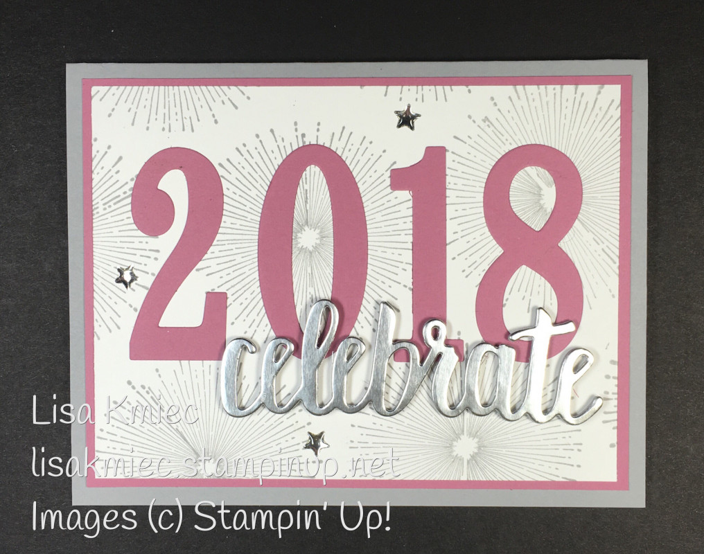
I focused on Lisa's:
-four-big-characters as focal point
-celebrate die cut
I changed:
-occasion
-numbers to letters
-colours
I used my grid mat to line up my letters and then taped them together and cut them out of my front panel. I then blended distress ink onto another panel, to show through. I kept the little centres of the letters to add back in.
Now. I don't actually have an 'eat' die cut. (do you?!) But if you look closely at that Essentials by Ellen Celebrate, the 'at' is together. I trimmed them out of the word, trimmed an 'e' and glued them onto my card front. Go take a closer look - you can hardly tell! I used a Quickie glue pen to adhere the thin die cuts. Its fine tip is perfect for delicate jobs like this.
Good morning! Here's a quick and somewhat snarky birthday card I made using some Catherine Pooler and CAS-ual Fridays goodies for the Birthday Stash event at StampNation as well as for the current Naughty or Nice Challenge
This card has nothing but stamping on it. Almost.
I started by stamping the yellow border and then added the swirl (looks like wind blowing, right?) by stamping off my grey ink for a softer look. I then fit the sentiment around it.
I finished by smooshing some Versamark ink along the bottom edge and embossing with sparkly embossing powder to add some sparkle and interest.