Good morning! Today I'm in The CLASSroom at Ellen Hutson. I'm one of Two Takes on a Trend, inspired by this:
UltraViolet is Pantone's colour of the year for 2018 and this dreamy palette of heathery purples, greys and greens is just gorgeous!
I mostly focused on the vegetables (are they peas? beans? I have never seen them in this colour!) - their horizontal, wavy lines and colours, plus the gold of the god's head in the field of flowers.
I quickly identified the distress inks I wanted to use and blended a 4.25 x 5 panel of Bristol Smooth cardstock, fading out to white at the top (so easy to blend on this smooth paper!). I was a bit nervous about the green to purple blend, so I tried to minimize the amount of space. In the end, I think it turned out great! I misted the panel with a Nuvo spritzer - the finer drops of water added just the right amount of texture to the colours, without taking too much of it away.
Once the coloured panel was dry, I laid my new Strands die (from the Essentials by Ellen January release) on the panel and cut out from the centre to the top, turned the die and cut again from the centre to the bottom. I removed the outline and placed the strips together on a piece of computer paper with Be Creative tape on it. I trimmed the panel and adhered it to a dark grey mat. I cut my sentiment out of gold mirror card backed with Be Creative tape (makes it easier to glue down!)
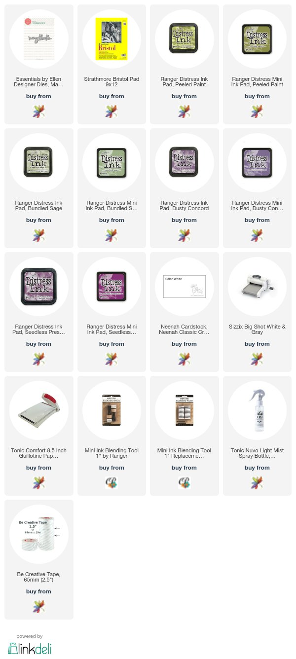
I used:


Great design Ardyth nx
ReplyDeleteBeautiful card Ardyth, the colour blend looks amazing, Cathy x
ReplyDeleteAmazing way to stretch that die, Ardyth! a beautiful card!
ReplyDelete=]
This is just stunning,Ardyth.
ReplyDeleteI thought the card was embossed. Taking the pieces and putting them together was a brilliant idea and the colors blend beautifully, Ardyth.
ReplyDeleteBeautiful card.
ReplyDelete