

Good morning! I'm excited to be part of a Blog Hop with some of the designers from the Catherine Pooler Creative Team and also some designers from WOW! Embossing Powders. We're hopping to show you how well these two product lines work together.

As you can see, I created two cards with stripes. What you maybe can't see is that they both used the exact same 6 WOW! Embossing Powders!
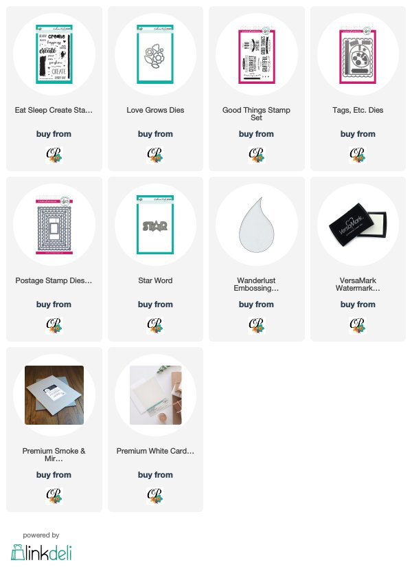
I thought it would be fun to show how different the powders look when you use a different ink as a base. I used the same stripe stamp from Eat, Sleep, Create for both cards. I used the same embossing powders in the same order. But for the Celebrate Everything card, I used Versamark ink. For the Star card, I used black Versafine ink.
Working top to centre (and then I reversed the order and worked back out to the bottom), I used
- Wanderlust (exclusive to Catherine Pooler Designs)
- Vintage Romance
- Silver Pearl
- Metalline First Frost
- Mermaid Tails
- Sand Dunes
The Versamark card resulted in colours that were soft, pretty and romantic, so I went with that feeling as I finished the card.

I used the scalloped rectangle from Tags, Etc. to trim the panel, and then I used the stitched rectangle from Postage Stamp dies to create an inner panel, which I popped up. I cut some flowers from the dies that match Love Grows, and coated them in Versamark before embossing them with Vintage Romance and Mermaid Tails. My sentiment comes from Good Things and was embossed in a seventh variety of embossing powder - Metallic Gold Rich Pale Superfine.

The black ink gave more industrial, metallic results so I kept my card very simple and masculine. Again, I used the stitched rectangle from Postage Stamp dies, but I turned it on my panel a bit so that the stripes would be on an angle.

I simply inlaid the new Star Word die into the panel and called it done.

No blog hop is complete without some prizes. Are you ready for some awesome giveaways?
WOW! Embossing Powder
Any 6 powders of your choice along with a WOW carry case to store your powders safely.
Catherine Pooler Designs
One Set of Life of the Party Inks
(Party Dress, Tutti Fruitti, Tiara, Tiki Torch, Lime Rickey, Aquatini, Something Borrowed, Flirty Fuschia)
The CP winner will be given a code to order the inks for free from the CP online shop.
Winners will be chosen randomly from the commenters who comment on ALL THE POSTS on the hop and will be announced on the WOW! blog during the week of July 2.
Fabulous cards show casing the WOW Embossing Powders. Thanks for hopping along Ardyth your cards are always inspirations. Cheers Jo
ReplyDeleteYour cards are lovely. Just the right amount of sparkle and shine without going overboard! I've never heard of some of these embossing colors so thank you for the intro!
ReplyDeleteLove them both. TFS.
ReplyDeleteThis comment has been removed by a blog administrator.
ReplyDeleteLove your colour combos - gorgeous cards!
ReplyDeleteJulie
x
Beautiful and sparkly!
ReplyDeleteReally beautiful cards.
ReplyDeletewhat fun cards, I often stamp with the VersaFine Black Onyx Ink and emboss with my colors - great result
ReplyDeletethanks for sharing
Barb Housner
Very pretty cards!!
ReplyDeleteFabulous cards💕
ReplyDeleteVery pretty cards. I love the sparkle!
ReplyDeleteFabulous cards. Love how the inks and embossing powders coordinates well together. 😍💕
ReplyDeleteSO STINKIN COOL ARDYTH!
ReplyDeleteGreat cards Ardyth
ReplyDeleteWow! Beautiful cards!!!
ReplyDeleteGorgeous, Ardyth! Love the sparkly stripes!
ReplyDeleteAwesome cards
ReplyDeleteBeautiful display of embossing powders. I love how you show the difference when using 2 different inks to emboss. Great designs as well.
ReplyDeleteBeautiful card's made with amazing products!
ReplyDeleteThis comment has been removed by a blog administrator.
ReplyDeleteVery interesting cards, they have a vintage look to them. Well done!
ReplyDeleteBeautiful cards!
ReplyDeleteLove it !
ReplyDeleteWho knew you could change up a card that much just by changing the ink color! That is awesome. Thanks!
ReplyDeleteI struggle with masculine cards and I love that you have included one in this post...Ardyth I love your videos!
ReplyDeleteLove both cards. Love the different looks just from a change of inks.
ReplyDeleteThanks for the wonderful inspiration.
ReplyDeleteThank you for showing us the WOW products.
ReplyDeleteLike your style of cards. Thanks.
ReplyDeleteLinda T
Great cards. Love them.
ReplyDeleteWhat a great way to show the WOW powders in action. Nice!
ReplyDeleteGorgeous cards Ardyth! I love stripes and adding embossing and glitter to them, well, that just makes them even better :)
ReplyDeleteLove your cards. The flowers card is over the top. Thanks for sharing.
ReplyDeleteI love those sparkly stripes! What fun cards! :)
ReplyDeleteLove all of your cards and (of course!) the gllitter!
ReplyDeleteStunning cards with beautiful shine and colors! What a difference the ink base makes on the embossing powder, cool to see a visual comparison.
ReplyDelete2nd card, angled stripes, very stunning
ReplyDeleteSuch beautiful cards!
ReplyDeleteThanks for sharing...
You’ve made two very beautiful cards !!
ReplyDelete[margessw(at)icloud(dot)com]
Such fun cards. Thank you for sharing.
ReplyDelete!g
ReplyDeleteLoving the stripes idea!
your card is amazing!!!!
ReplyDeletePretty cards! I love the glitter :)
ReplyDeleteLoving the color combinations!
ReplyDeleteOh Wow, these are fun ideas with the stripes and those great colors! Thanks for sharing with us on this blog hop!!
ReplyDeleteI love blog hops because they inspire me to create and I learn about products that are new to me--thank you.
ReplyDeleteNice cards - I do like the subtle colors more. Thanks for the inspiration and idea of using that stripe stamp!
ReplyDeleteGreat cards!!
ReplyDeleteLoved your cards.
ReplyDeleteI love the masculine card - so cool to see how the embossing powder shows up. Thanks for sharing!
ReplyDeleteVery pretty cards - love the color combinations.
ReplyDeleteGreat cards! Love the powders!
ReplyDeleteThe postage stamp die is very popular and I like the look. Like the embossing of wow powder on the flowers. Great cards.
ReplyDeleteThat is really amazing what a difference the Versamark and Versafine inks made in results. Good lesson.
ReplyDeleteLove the comparison of colors...great cards!
ReplyDeleteWonderful use of the embossing powders.
ReplyDeleteHow clever and creative using the WOW powders as stripes! Love the color combo. Thanks for the inspiration.
ReplyDeleteLove the stripes Ardyth!
ReplyDeleteI'm a real lover of bright colors...but these muted tones really pack a WOW ;) the way you've created your cards Ardyth!! Very nice! TFS! :)
ReplyDeleteBeautiful cards!
ReplyDeleteLove the simplicity of your cards. The colour combinations are beautiful
ReplyDeleteLove your cards Ardyth, these ink colours look amazing with the WOW EP's! ♥
ReplyDeleteLove the stripes! Especially the neutral one with a pop of color. Great job.
ReplyDeleteI love stripes on cards in the background like this. Great use of the inks & Wow E.P.
ReplyDeleteBeautiful cards showing the versatility of the WOW embossing powders with different ink colors. My mind is racing with all of the possibilities! Thanks for sharing.
ReplyDeleteThanks for making clear how the embossing powders can enhance any color ink they overlay!
ReplyDeleteLove your cards
Love those flowers. Wouldn't it be nice to have real life glitter flowers
ReplyDeleteI love the masculine one!
ReplyDeleteWhat a beautiful card. I love the colors and the sparkle. Thanks for sharing.
ReplyDeleteGreat examples to show how same embossing powders look different. I really like the versa mark and the resulting shades.
ReplyDeleteGreat reminder of how fun embossing powders can be
ReplyDeleteI am learning so much from this hop! Thank you for sharing!
ReplyDeleteGreat cards and thanks for showing what a difference the ink makes.
ReplyDeleteThank you so very much for sharing your beautiful cards and how the ink makes a difference. Great Blog Hop! So hopping along to the next person.
ReplyDeleteLOVE LOVE LOVE all the glitter and colors. What a wonderful way to make it jump out!
ReplyDeleteLove these embossing powders...really makes me think it can be used on masculine cards too!
ReplyDeleteBoth of your cards are so cool! Thanks for sharing how different the embossing powders look with different inks :)
ReplyDeleteThose are amazing cards - and different. Nice job.
ReplyDeleteHow very interesting that the powders came out so different using different inks! I've always used versamark (except with clear ep) and never even thought to use black for anything! I can't wait to try it! Your cards are gorgeous (I love stripes!).
ReplyDeleteLike what you did with the stripes.
ReplyDeleteGreat cards! I love your color combo.
ReplyDeleteLove the soft vintage colors in the first card!
ReplyDeleteBeautiful cards! I like the colors and the sparkle. :)
ReplyDeleteSuch a cool effect, Ardyth. Love how different these EPs look when using different ink colours. Awesome cards!
ReplyDeleteMarianne x
Cool stripes!
ReplyDelete
ReplyDeleteLove the striped cards, great effect, love the WOW EPs. Great not having to remember to dust the cards first.
Di Brown.
Beautiful cards. Cool how the different ink gives totally new look.
ReplyDeleteWhat fun! I love experimenting like this!!! I'd love to see what those same colors look like embossed on kraft with just versamark since the color of the paper would tint the look. I often make cards on black, kraft, and fog gray card bases so I have a swatch of my embossing powders on all 4 cardstocks.... but I never thought to try them over different inks!!! I have to redesign my swatch sheet and redo it now!... Not to mention after this hop, there are plenty of new powders I'd like to add to my collection!!!
ReplyDeleteWonderful card
ReplyDeleteThank you for sharing your work.
Your cards are gorgeous! I love them all!
ReplyDeleteGreat cards! It's amazing the difference in colors when using the black ink underneath the embossing powders. I prefer the softer look with the clear Versamark, but the other would be great for certain cards, especially masculine ones. Thanks for comparing the two.
ReplyDeleteGorgeous sparkle & love the stripes
ReplyDeleteLovely design!
ReplyDeleteCool technique. A lot like Kelly Latevola's under-painting with Distress Oxide inks and copics.
ReplyDeleteเที่ยวเมืองไทยที่ไหนดี
A match made in heaven!
ReplyDeleteLove, love, love your cards! I do believe I have glitter in my veins as this embossing powder is calling my name! TFS your creativity!
ReplyDeleteGreat cards.
ReplyDeleteYour cards are so pretty - love the dimension.
ReplyDeleteLove the cards. Thanks for sharing.
ReplyDeleteWOW powders are gorgeous. I definitely need more.
ReplyDeleteGreat cards! Thank you.
ReplyDeleteLove the cards. So pretty
ReplyDeleteHow gorgeous. The colours you've chosen work so well together.
ReplyDeleteWow, I never thought to use versafine ink under colored embossing powders/glitters. What a difference. Like having twice as many embossing colors!
ReplyDeleteArdyth, both cards are super amazing.
ReplyDeleteLove love love love love the glitery backgrounds for sure.
Love your cards! Those embossing powders are gorgeous! Thanks for the inspiration!
ReplyDeletethe cards are so pretty.
ReplyDeletethanks for showing how different
inks make the embossing powder
look different. You ovten
don't think about that but it
does make a difference.
txmlhl(at)yahoo(dot)com
So very pretty & sparkly!!
ReplyDeleteLove the gorgeous cards. The embossing powders are beautiful. I love the different looks you get with different base inks. That is such a great way of stretching supplies!
ReplyDeleteBeautiful cards love the sparkle
ReplyDeleteSuch pretty sparkly stripy goodness!
ReplyDeletelove these cards! It is fun to see how the embossing powders look different over clear and black ink.
ReplyDeleteLove the stripes in the backgrounds!
ReplyDeleteLove the glitz and sparkle on these projects. Thanks for sharing your creativity.
ReplyDeleteAlways looking for cards that are more masculine in nature. Thank you for your example. Peace!
ReplyDeleteYour cards are beautiful! Love the WOW!
ReplyDeleteFun cards, clean and simple.
ReplyDeleteGreat cards using the embossing powder.
ReplyDelete