Saturday, 13 July 2013
CFC109 - Polka Dots
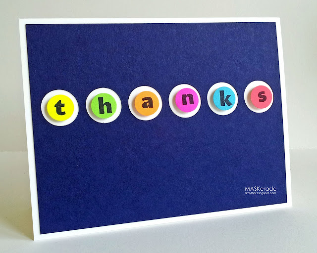
A quick thank you card for this week's CASual Friday challenge, to use polka dots. And they left us a good reminder to watch the 'white' (or clear) space in our submissions. I have to agree that white space is probably the biggest factor in a design being CAS.
I still had my neon papers out and they look so good when they pop against a dark background, so I created this navy panel on my Silhouette and then used a circle punch to cut the neon dots to place in the negative cuts in the navy panel. I used Avery Elle's Fun with Letters Alphabet and popped them up on foam dots for a little dimension.
Subscribe to:
Post Comments (Atom)


Wow! Those beautiful bright colors look amazing against that deep blue! Awesome card, Ardyth!
ReplyDeleteAwesome contrast of colors! Love this card!
ReplyDeleteLove this! The neon pops!
ReplyDeleteWhat a fabulous bright and funky card Ardyth-those letters really stand out perfectly against the blue.
ReplyDeleteHave a lovely weekend,Nessa xx
Such fun, Ardyth ... brilliant colours against the dark blue ... awesome precision circle cutting! Anita :)
ReplyDeleteLove how the colors pop against the navy background Ardyth!
ReplyDeleteLike so many of your cards, I see it and then think "BRILLIANT"!
ReplyDelete:-) Love the bright colour against the navy!
ReplyDeleteSo so COOL!!
ReplyDeleteIt should be CASAF, clean and simple and fabulous.
ReplyDeleteLove the pops of neon against the gorgeous navy panel! Seeing what you have just created with your Silhouette has me so anxious for mine to arrive!
ReplyDeleteAnd now I know that neon pops against navy, too! Super fun design, Ardyth!
ReplyDeleteLove your CAS designs - always inspiring. TFS ;-)
ReplyDeleteSo bright and cheery! Love the popped up letters!
ReplyDeleteThis is such a fun card...love your bright blue background, so fun for a sweet thank you card.
ReplyDeleteHere here.... to your comment about white space and you also show us how you can make brilliant CAS cards with a small list of supplies too!! I just love how the colours and shapes do the talking here along with the sentiment :0)
ReplyDeleteJenny x
Wow, neon looks fab with navy! Ultra-CAS (of course!) and very effective!
ReplyDeleteAw..how perfectly lovely is this! Love the striking contrast of the neon with the dark blue background! The pop-up dimensions are fabulous, too!
ReplyDeleteAwesome design--those neon letters really pop against the blue. And, how fun that your white space is blue! (are you a rebel in secret?)
ReplyDeleteYour polka dots look great, very you. In fact we should call tem Ardyth dots ;)
ReplyDeleteAnother fabulous card from you! This is so cool!
ReplyDeleteI want to press them! Wonderful design, and even better colors!! So glad you joined the CAS-ual Fridays Challenge again, Ardyth (I know, I'm visiting out of order)!
ReplyDelete