Congratulations to this week's Featured Stamper, Debby (limedoodle).
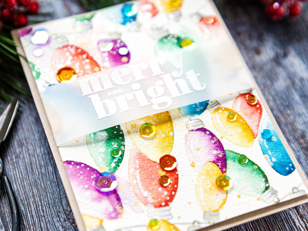
I chose this card as my inspiration:

I focused on Debby's:
-Christmas light theme
-vellum band for sentiment
I changed:
-colours
-ink blending instead of watercoloring
-dark background
-size/shape of card
I started by cutting negative masks for my Christmas light bulbs and blending ink through them, adjusting pressure to create shadows and highlights. This helped to make my lights look dimensional and shiny.
I blended night-time colours between the lights for some extra drama and then tried to figure out how to make the light sockets look realistic, despite the fact that they were the same colour as the inks.
Here's a video showing how I used 3 simple strategies to rescue this card:


Ardyth, your videos are the best. You are so good at explaining things and showing us you make goofs just like we do. Thanks for your great videos and encouragement.
ReplyDelete