This week's Less is More challenge is to make a one layer card with three stamps. Not two, not four.
So I used one long wide strip from Papertrey, and then I looked for a sentiment. Most of my clear Happy Birthday stamps have been cut in half so that I can separate them or colour them differently or stack them. But, I'm happy to say, that this Happy came separately from this Birthday (both Waltzingmouse), so I really did use three stamps!
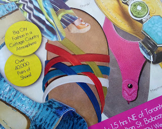
The inspiration for this card came from a pair of sandals in this month's Toronto Life:
A card like this takes precision because there's nowhere to hide. Precision in measuring and placement of stamps, and full coverage in ink. I'm proud to let you know that this is only the fourth attempt (I had problems in all 3 categories)!! (and I still think that 'birthday' is a hair lower than 'happy', but I'm done! lol!)
This is my favourite card for this week, so I'm also linking it to 52 Card Pick up (Week 19) at The Old Back Porch.


Ardyth you made me laugh with your comment to my large white card with the red lip and the heart ...
ReplyDeletequote:
"Most of my clear Happy Birthday stamps have been cut in half... "
I do the same ;) so I can handle this "happy birhtday" better ;)
I love the bright colors of your card, and the idea behind.
Monika
Great Colors and inspiration!
ReplyDeleteFantastic, colorful card!
ReplyDeleteLove the colours, love the card
ReplyDeleteFabulous design
Thank you very much
mandi
"Less is More"
Very COOL card! The way the strips of color interact with each other and create another color is really interesting!
ReplyDeleteLovely colours! What amazing placement.
ReplyDeleteBrilliant take on the photo and perfect for the challenge too...I luuurve those bright stripes :0)
ReplyDeleteJenny x
it is not easy to get full ink coverage on bg stamps....this is amazing Ardyth. I love your design.
ReplyDeleteOohh!! The colours looks good together :P)
ReplyDelete:)*
ReplyDeleteSo, so clever. This is my favourite so far. Loved the source of your inspiration.
ReplyDeleteThis looks awesome and was so worth the 4 tries! Don't know if I would have been that dedicated...
ReplyDeleteWhat a great look you created here, love your inspiration and one layer card!
ReplyDeleteTerrific card Ardyth.
ReplyDeleteGreat stamping.
Thanks so much
Chrissie
"Less is More"
Stunning - perfect stamping and colours.
ReplyDeleteKath x
Wow, this is an amazing design. I love it. And I love the sandal that you used for inspiraion, too! I'd like a pair of those :)
ReplyDeleteFabulous card - I love the colours and the design, hugs x x
ReplyDeleteFabulous eye-catching card.
ReplyDeleteGreat colors and fabulous stamping. I have a terrible time lining things up. You did great! Ann Y.
ReplyDeleteWhat a clever card idea! Nice card.
ReplyDeleteFANTASTIC stamping Ardyth - funny how the "simplest" cards are often the most difficult :)
ReplyDeleteGreat modern card! Love it :-)
ReplyDeleteArdyth, you nailed the inspiration challenge...and I absolute love the bright colors! I'm glad you explained about the sentiment stamp, because I was sitting here looking at the card saying to myself...now she didn't use but TWO stamps! LOL!!! Beautiful job!
ReplyDeleteThis is incredible!!!
ReplyDelete